Creation of a linechart object that can be inserted in a 'Microsoft' document.
In a line chart, category data is distributed evenly along the horizontal axis, and all value data is distributed evenly along the vertical axis. Line charts can show continuous data over time on an evenly scaled axis, so they're ideal for showing trends in data at equal intervals, like months and quarters.
Arguments
- data
a data.frame
- x
column name for x values.
- y
column name for y values.
- group
grouping column name used to split data into series. Optional.
- labels
column names of columns to be used as custom data labels displayed next to data points (not axis labels). Optional. If more than one name is provided, only the first one will be used as a label, but all labels (transposed if a group is used) will be available in the Excel file associated with the chart.
- asis
logical parameter defaulting to FALSE. When FALSE, the data is reshaped internally so that each series becomes a separate column. When TRUE, the data is used as-is and must already have one column for categories and one column per series, and
yaccepts a vector of series column names.asisdescribes the input shape read by the constructor. Not to be confused with thewrite_dataargument ofsheet_add_drawing.ms_chart(), which controls whethermschartwrites the chart's data into an Excel sheet at embed time. The two are independent.
See also
chart_settings(), chart_ax_x(), chart_ax_y(),
chart_data_labels(), chart_theme(), chart_labels()
Other 'Office' chart objects:
ms_areachart(),
ms_barchart(),
ms_boxplotchart(),
ms_bubblechart(),
ms_chart_combine(),
ms_funnelchart(),
ms_histogramchart(),
ms_paretochart(),
ms_piechart(),
ms_radarchart(),
ms_scatterchart(),
ms_stockchart(),
ms_sunburstchart(),
ms_treemapchart(),
ms_waterfallchart()
Examples
library(officer)
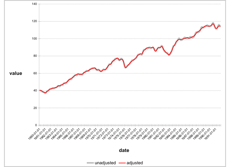
# example chart_01 -------
chart_01 <- ms_linechart(
data = us_indus_prod,
x = "date", y = "value",
group = "type"
)
chart_01 <- chart_ax_x(
x = chart_01, num_fmt = "[$-fr-FR]mmm yyyy",
limit_min = min(us_indus_prod$date), limit_max = as.Date("1992-01-01")
)
chart_01 <- chart_data_stroke(
x = chart_01,
values = c(adjusted = "red", unadjusted = "gray")
)
chart_01 <- chart_data_line_width(
x = chart_01,
values = c(adjusted = 2, unadjusted = 5)
)
chart_01 <- chart_theme(chart_01,
grid_major_line_x = fp_border(width = 0),
grid_minor_line_x = fp_border(width = 0)
)
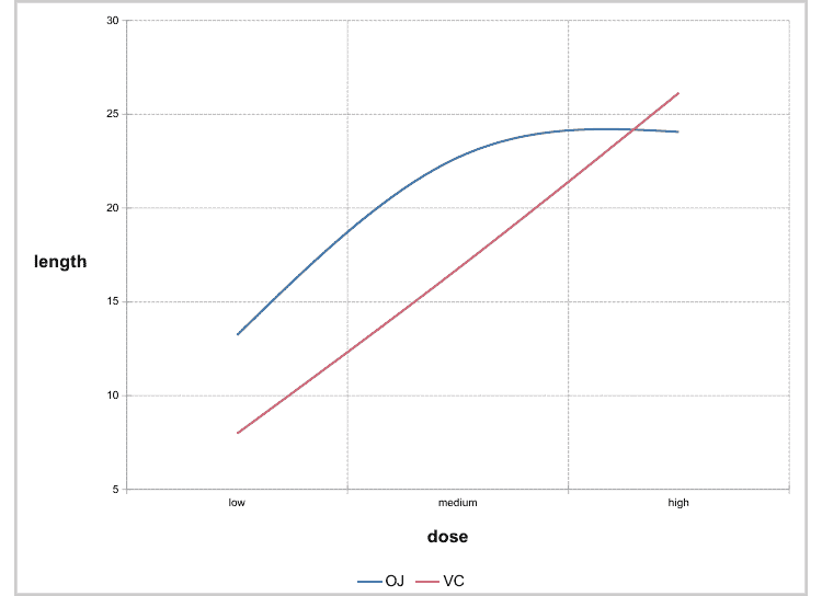
# example chart_02 -------
data <- data.frame(
supp = factor(rep(c("OJ", "VC"), each = 3), levels = c("OJ", "VC")),
dose = factor(rep(c("low", "medium", "high"), 2), levels = c("low", "medium", "high")),
length = c(13.23, 22.7, 24.06, 7.98, 16.77, 26.14),
label = LETTERS[1:6],
stringsAsFactors = FALSE
)
chart_02 <- ms_linechart(
data = data, x = "dose", y = "length",
group = "supp", labels = "label"
)
chart_02 <- chart_ax_y(
x = chart_02, cross_between = "between",
limit_min = 5, limit_max = 30,
num_fmt = "General"
)
chart_02 <- chart_data_labels(
x = chart_02, position = "l"
)
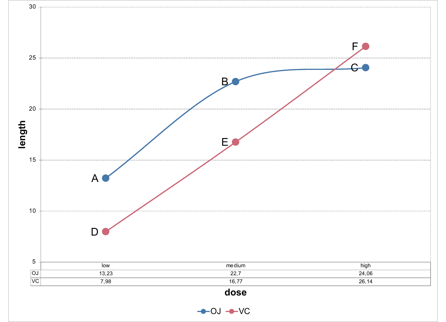
# example chart 03 -------
chart_03 <- ms_linechart(
data = data, x = "dose", y = "length",
group = "supp", labels = "label"
)
chart_03 <- chart_ax_y(
x = chart_03, cross_between = "between",
limit_min = 5, limit_max = 30,
num_fmt = "General"
)
chart_03 <- chart_data_labels(
x = chart_03, position = "l"
)
chart_03 <- chart_settings(
x = chart_03, table = TRUE
)
chart_03 <- chart_table(chart_03,
horizontal = TRUE, vertical = FALSE,
outline = TRUE, show_keys = FALSE
)