Chapter 12 Charts with mschart
12.1 What it is, what it isn’t
Package mschart produces native Microsoft Office charts. The chart and
its underlying data are written into the destination file (Word, PowerPoint
or Excel), so the result can be re-opened, edited, restyled or annotated by
non-R users with only the host application.
mschart is not a ggplot2 replacement. It exposes a subset of what
‘Office Chart’ supports natively, no more. The typical use case is to
industrialise a small catalogue of standard charts that downstream readers
will then adjust themselves.
The supported chart families are:
- bar charts:
ms_barchart() - line charts:
ms_linechart() - scatter plots:
ms_scatterchart() - area charts:
ms_areachart() - pie / doughnut charts:
ms_piechart() - bubble charts:
ms_bubblechart() - radar (spider) charts:
ms_radarchart() - stock charts (HLC and OHLC candlesticks):
ms_stockchart()
Several charts can be overlaid into a single combined chart with
ms_chart_combine() (see Combining charts).
To embed a chart in a Word, PowerPoint or Excel document, see Embedding a chart in a document and the corresponding officer chapters.
12.2 The API model
mschart follows a two-layer API similar in spirit to ggplot2:
- A constructor of the
ms_*()family builds a chart object from a data frame. - Modifiers (
chart_*(),set_theme(),as_bar_stack(), …) take a chart and return a new chart with the requested change applied. They are pipe-friendly and can be chained.
12.2.1 Constructor signatures
All ms_*() constructors share the same core arguments and add a few
type-specific ones:
| Argument | Used by | Meaning |
|---|---|---|
data |
all | a data.frame holding the chart data |
x |
all | column name for the categorical or x-numeric axis |
y |
all (except ms_stockchart()) |
column name for the numeric value |
group |
most | column name splitting the data into series |
labels |
most | column name for custom data labels |
size |
ms_bubblechart() |
column name encoding bubble area |
open, high, low, close |
ms_stockchart() |
OHLC / HLC columns |
12.2.1.1 Input shape: long vs wide (asis)
All constructors default to long-format input: one row per
observation, with a group column splitting the data into series.
mschart reshapes the table internally to one column per series
before generating the chart XML.
browser | serie | value |
|---|---|---|
character | character | integer |
Chrome | serie1 | 1 |
IE | serie1 | 2 |
Firefox | serie1 | 3 |
n: 3 | ||
Set asis = TRUE when the data is already wide — one column for the
x axis, one column per series — and pass the series names as a vector
in y:
browser_wide <- browser_data |>
  pivot_wider(names_from = serie, values_from = value)
head(browser_wide, 3)
browser | serie1 | serie2 | serie3 |
|---|---|---|---|
character | integer | integer | integer |
Chrome | 1 | 7 | 13 |
IE | 2 | 8 | 14 |
Firefox | 3 | 9 | 15 |
n: 3 | |||
bars_wide <- ms_barchart(browser_wide,
                         x = "browser",
                         y = c("serie1", "serie2", "serie3"),
                         asis = TRUE)
Both produce the same chart. Pick the shape that matches your data pipeline.
asis describes the input shape read by the constructor. Do not
confuse it with write_data, which appears on sheet_add_drawing()
and controls whether mschart writes the chart data into the Excel
sheet for you (see Excel — recommended path: write your data, then
attach the chart). The two are independent: a chart built with
asis = TRUE can still be attached with either write_data = TRUE
or write_data = FALSE.
12.2.2 Modifier families
| Family | Purpose |
|---|---|
chart_settings() |
type-specific chart options (stacked, smooth, …) |
chart_ax_x(), chart_ax_y() |
axes (range, format, ticks) |
chart_labels(), chart_labels_text() |
chart titles (text and font) |
chart_data_labels() |
data point / bar labels |
chart_data_*() |
per-series visual styling (fill, stroke, …) |
mschart_theme(), set_theme(), chart_theme() |
global theme |
12.2.3 A minimal end-to-end example
library(mschart)

bars <- ms_barchart(browser_data,
                    x = "browser", y = "value", group = "serie") |>
  chart_settings(grouping = "stacked") |>
  chart_labels(title = "Browser usage") |>
  chart_theme(legend_position = "b")
While iterating on a chart, the fastest way to look at the result is the
preview argument of print():
This writes the chart to a temporary PowerPoint file and opens it in the default viewer. To embed the chart in a real document, see Embedding a chart in a document.
12.3 Chart settings
chart_settings() is an S3 generic with one method per chart family. Each
method exposes the options that are meaningful for that specific chart
type, so the available arguments depend on the class of the chart object.
| Chart type | Main chart_settings() arguments |
|---|---|
ms_barchart |
grouping ("clustered", "stacked", "percentStacked", "standard"), dir, gap_width, overlap |
ms_linechart |
style ("none", "line", "lineMarker", "marker", "smooth", "smoothMarker"), grouping ("standard", "stacked", "percentStacked") |
ms_areachart |
grouping ("standard", "stacked", "percentStacked") |
ms_scatterchart |
style ("none", "line", "lineMarker", "marker", "smooth", "smoothMarker") |
ms_piechart |
hole_size (0 = pie, > 0 = doughnut) |
ms_bubblechart |
bubble3D |
ms_radarchart |
style ("standard", "marker", "filled") |
ms_stockchart |
hi_low_lines, up_bars_fill, up_bars_border, down_bars_fill, down_bars_border |
Refer to ?chart_settings for the full per-method signature, including
common arguments such as vary_colors and table (data table below the
plot, supported by bar / line / area / stock).
Example with a scatter plot showing both markers and connecting lines:
The as_bar_stack() helper is a shortcut for chart_settings(grouping = "stacked")
on a bar chart, with an additional dir argument for vertical / horizontal
orientation and a percent flag for percent stacking.
12.4 Axes
chart_ax_x() and chart_ax_y() share almost the same set of arguments;
they differ only in a few axis-position defaults. Their arguments group
into four roles:
Range
limit_min,limit_max— axis bounds (date values are accepted on a date axis).position— value at which this axis crosses the perpendicular one.
Number format
num_fmt— an Excel format string ("0.00","0%","yyyy-mm",'#,##0,"K"', …). The full syntax is documented by Microsoft; a few common examples:Format string Renders 1234.5 as "0"1235"0.00"1234.50"#,##0"1,235'#,##0,"K"'1K"0.0%"123450.0%(input is multiplied by 100)"yyyy-mm"(date input) 2024-03Conditional formats such as
'[>=1000000]0.0,,"M";[>=1000]0.0,"K";0'are also supported.
Ticks
major_tick_mark,minor_tick_mark—"in","out","cross","none".tick_label_pos—"high","low","nextTo","none".major_unit,minor_unit— interval between major / minor ticks on a numeric axis.major_time_unit,minor_time_unit—"days","months","years"on a date axis.
Direction and display
orientation—"minMax"(default) or"maxMin"(reversed).crosses,cross_between— how this axis crosses the perpendicular axis.display—TRUE/FALSEto show or hide the axis.rotation— label rotation, between-360and360degrees.
The OOXML spec works with intervals, not with a target count of ticks.
There is no equivalent to scales::pretty_breaks(n). To target a number
of ticks N, compute the interval yourself:
major_unit = (limit_max - limit_min) / (N - 1).
Numeric axis with shorthand suffixes and a fixed major interval:
Date axis with one tick per month:
12.5 Labels, titles and legend
Three close-but-distinct functions are easy to mix up:
chart_labels(title=, xlab=, ylab=)— sets the text content of the chart title, x-axis title and y-axis title.chart_labels_text(fp_text)— sets the typography of those titles (font, size, colour, bold, …) via anofficer::fp_text()object.chart_data_labels(...)— turns on and configures the per-point / per-bar value labels (show_val,show_percent,show_cat_name,show_serie_name,position, …).
The legend is part of the theme, but its position is the most-asked tweak.
There are two ways to control it via chart_theme():
Preset positions through legend_position:
"b","t","l","r"— bottom / top / left / right."tr"— top-right corner."n"— no legend.
Manual placement through legend_x, legend_y, legend_w,
legend_h. Each value is a fraction of the chart area between 0 and 1
((0, 0) is the top-left). Setting any of them switches the legend to a
manual <c:manualLayout>; all four should be set together.
Pie chart with percentage labels outside the slices:
12.6 Series styling
The chart_data_*() family targets one visual property per function. Each
of them accepts either a single value (applied to every series) or a
named vector with one entry per group level.
| Function | What it controls |
|---|---|
chart_data_fill() |
fill colour. Aligns the stroke with the new fill by default; pass update_stroke = FALSE to keep the previous stroke. |
chart_data_stroke() |
stroke (border) colour. |
chart_data_line_width() |
line width in points. |
chart_data_line_style() |
"none", "solid", "dotted", "dashed". |
chart_data_size() |
marker size. |
chart_data_symbol() |
"circle", "square", "diamond", "triangle", "dash", "plus", "x", "star", "dot", "none", "auto". |
chart_data_smooth() |
0 / 1, line smoothing. |
chart_labels_text() |
font of data labels (and chart titles, see above). |
Not every property applies to every chart type. The supported matrix is:
| Property | bar | line | area | scatter | stock | radar | bubble | pie |
|---|---|---|---|---|---|---|---|---|
| fill | x | x | x | x | x | x | x | x |
| colour | x | x | x | x | x | x | x | x |
| symbol | x | x | x | x | ||||
| size | x | x | x | x | ||||
| line_width | x | x | x | x | x | x | x | x |
| line_style | x | x | x | x | ||||
| smooth | x | x | ||||||
| labels_fp | x | x | x | x | x | x |
Setting an unsupported property emits a warning and is ignored.
Example, three-series bar chart with custom fills and transparent strokes:
12.7 Themes
A theme bundles the formatting properties (fonts, borders, colours, backgrounds) that govern the non-data parts of a chart: titles, axes, gridlines, legend, plot area, chart area.
There are three entry points:
mschart_theme(...)builds a theme object from scratch, returning a reusablemschart_themevalue.set_theme(chart, theme)replaces the chart’s current theme with the one passed.chart_theme(chart, ...)is the most common path: it modifies the selected fields of the chart’s existing theme in place.
12.7.1 Inheritance
Some theme fields inherit from a parent. Setting the parent applies to both children unless they have been overridden:
axis_title_xandaxis_title_yinherit fromaxis_title(all expect anofficer::fp_text()).grid_major_line_xandgrid_major_line_yinherit fromgrid_major_line(all expect anofficer::fp_border()).grid_minor_line_xandgrid_minor_line_yinherit fromgrid_minor_line.
12.7.2 Available theme fields
The full list of arguments accepted by mschart_theme():
- axis_text
- axis_text_x
- axis_text_y
- axis_ticks
- axis_ticks_x
- axis_ticks_y
- axis_title
- axis_title_x
- axis_title_y
- chart_background
- chart_border
- date_fmt
- double_fmt
- grid_major_line
- grid_major_line_x
- grid_major_line_y
- grid_minor_line
- grid_minor_line_x
- grid_minor_line_y
- integer_fmt
- legend_h
- legend_position
- legend_text
- legend_w
- legend_x
- legend_y
- main_title
- plot_background
- plot_border
- str_fmt
- table_text
- title_rot
- title_x_rot
- title_y_rot
12.8 Combining charts
ms_chart_combine() overlays multiple chart objects that share the same
category axis into a single visual. Each chart is rendered with its own
series, and the combined chart can carry a secondary y or x axis for
charts whose values live on a different scale.
All chart arguments must be named: ms_chart_combine(a, b) errors
out, use ms_chart_combine(empl = a, gdp = b) instead.
Three things to keep in mind when combining charts:
One sheet, unique names. All sub-charts share a single embedded spreadsheet. Each y-series column must therefore have a distinct name; if two charts use the same x column name, they must also use the same x values, otherwise the sheet would have two contradictory versions of the same column.
One secondary axis at a time. A combo can carry one secondary
axis: either a right-hand y axis (secondary_y) or a top x axis
(secondary_x). Office charts don’t support stacking four axes,
and mschart will reject a combo that asks for both.
The first chart drives the layout. The primary chart owns the
bottom and left axes; secondary charts borrow them or replace them.
Its title and axis labels are kept; secondary charts only contribute
the label of the axis they take over. The primary itself cannot be
passed to secondary_y or secondary_x.
Canonical example: stacked bars (employment) overlaid with a line chart on a secondary y axis (price deflator):
dat <- longley
dat$Year <- as.Date(paste0(dat$Year, "-01-01"))
dat_empl <- data.frame(
Year = rep(dat$Year, 2),
value = c(dat$Employed, dat$Unemployed),
serie = rep(c("Employed", "Unemployed"), each = nrow(dat))
)
empl <- ms_barchart(dat_empl, x = "Year", y = "value", group = "serie") |>
chart_ax_x(num_fmt = "yyyy") |>
as_bar_stack(dir = "vertical") |>
chart_labels(
title = "Longley's Economic Regression Data",
xlab = "1947 to 1962", ylab = "Employment"
)
gdp <- ms_linechart(dat, x = "Year", y = "GNP.deflator") |>
chart_labels(ylab = "GNP implicit price deflator (1954 = 100)")
combo <- ms_chart_combine(empl = empl, gdp = gdp, secondary_y = "gdp")
doc <- read_pptx()
doc <- add_slide(doc, layout = "Title and Content", master = "Office Theme")
doc <- ph_with(doc, value = combo, location = ph_location_fullsize())
print(doc, target = "static/office/gallery_combo_01.pptx")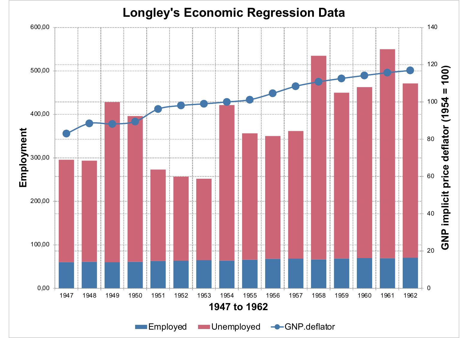
Combining a bar chart with a stock chart works and is the recipe used to fake error bars on top of bars (mean ± SE).
12.8.1 Independent x ranges with secondary_x
The example above shares a single x column (Year) across both
charts and routes the second chart to the right-hand y axis. A
different combination is to share the y axis and give each chart
its own x range — one on the bottom axis, one on the top. This is
what secondary_x enables.
When the secondary chart’s x column has a different name from the primary’s, both columns are kept side by side in the embedded sheet, rows aligned by position with NA-padding when lengths differ. Each chart resolves to its own x range; the y axis is shared.
The mechanism is type-agnostic and works wherever an x axis carries a meaningful scale:
- scatter / bubble charts with disjoint numeric x ranges
(
c:valAx— e.g. temperature in °C on the bottom and pressure in hPa on the top, sharing humidity on y). - line / area charts with disjoint date ranges (
c:dateAx— e.g. one period at the bottom, another period at the top, sharing an indicator on y).
Bar charts use a categorical axis (c:catAx) and do not benefit
from this mode.
Two scatter clouds with independent x scales:
set.seed(1)
weather <- data.frame(
temperature_c = runif(20, 5, 30),
pressure_hpa = runif(20, 990, 1030),
humidity_t = runif(20, 30, 90),
humidity_p = runif(20, 30, 90)
)
sc_temp <- ms_scatterchart(weather, x = "temperature_c", y = "humidity_t") |>
chart_labels(
title = "Humidity vs temperature and pressure",
xlab = "Temperature (°C)", ylab = "Humidity (%)"
)
sc_pres <- ms_scatterchart(weather, x = "pressure_hpa", y = "humidity_p") |>
chart_data_symbol(values = "triangle") |>
chart_labels(xlab = "Pressure (hPa)")
combo_secx <- ms_chart_combine(
temp = sc_temp, pres = sc_pres,
secondary_x = "pres"
)
doc <- read_pptx()
doc <- add_slide(doc, layout = "Title and Content", master = "Office Theme")
doc <- ph_with(doc, value = combo_secx, location = ph_location_fullsize())
print(doc, target = "static/office/gallery_combo_secx.pptx")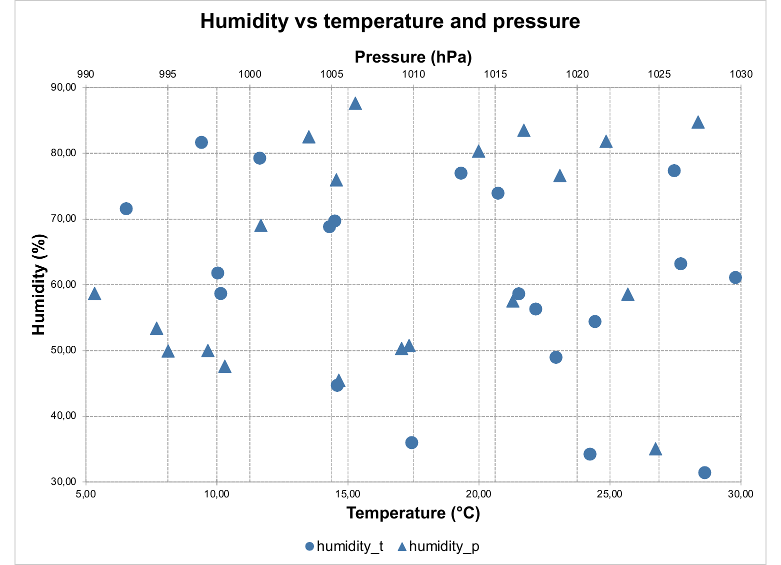
The y series must use distinct column names across charts
(humidity_t vs humidity_p here): the embedded sheet cannot hold
two columns with the same header.
12.9 Reference gallery and recipes
This section is split in two: a gallery with one compact example per chart family, and a recipes subsection covering the patterns that come up most often on the issue tracker (highlighting a bar, sorting bars, target lines, error bars, scatter trend lines).
Every example assumes the small helper below has been defined once. It bundles the standard PowerPoint embedding so the chart-specific code stays at the front of the line:
preview_pptx <- function(chart, file) {
doc <- read_pptx()
doc <- add_slide(doc, layout = "Title and Content", master = "Office Theme")
doc <- ph_with(doc, value = chart, location = ph_location_fullsize())
print(doc, target = file)
}The bundled browser_data (long-format browser usage by series) and
browser_ts (browser frequency over time) datasets are reused
throughout, together with the base R datasets mtcars, iris and
EuStockMarkets.
12.9.1 Gallery — one example per chart type
12.9.1.1 Bar (clustered)
ms_barchart(browser_data, x = "browser", y = "value", group = "serie") |>
preview_pptx("static/office/gal_bar.pptx")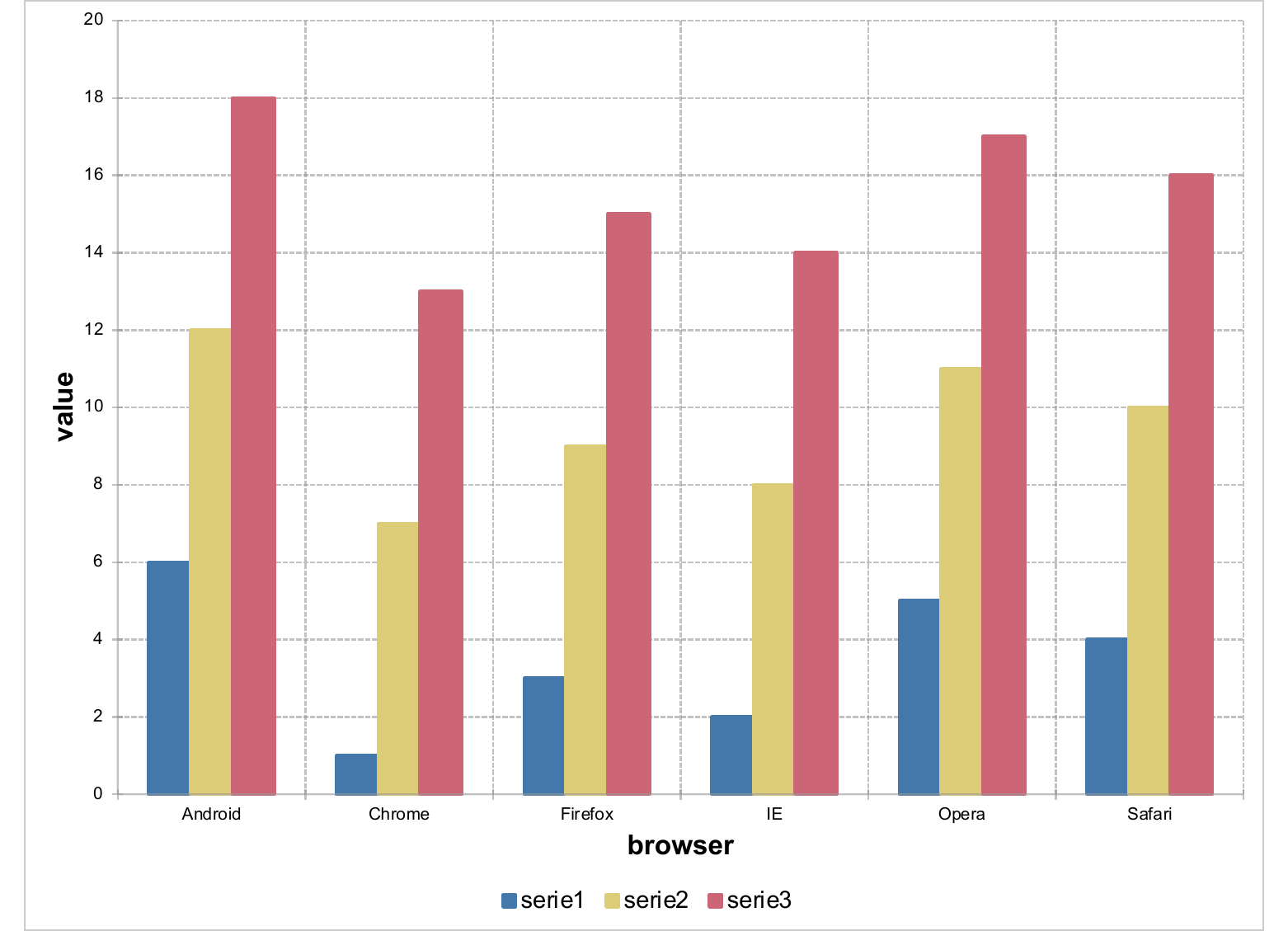
12.9.1.2 Line (date axis)
ms_linechart(browser_ts, x = "date", y = "freq", group = "browser") |>
chart_ax_x(num_fmt = "yyyy-mm") |>
preview_pptx("static/office/gal_line.pptx")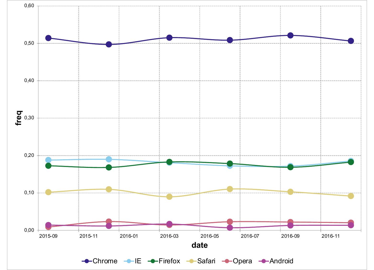
12.9.1.3 Area (percent stacked over time)
ms_areachart(browser_ts, x = "date", y = "freq", group = "browser") |>
chart_settings(grouping = "percentStacked") |>
chart_ax_x(num_fmt = "yyyy-mm", cross_between = "midCat") |>
preview_pptx("static/office/gal_area.pptx")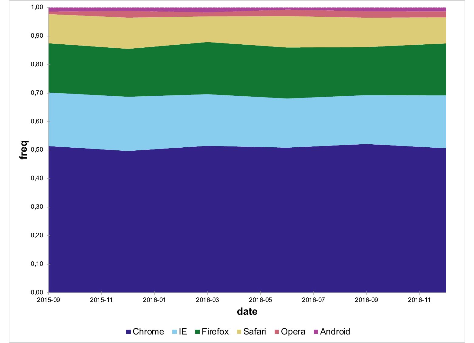
12.9.1.4 Scatter
mtc <- mutate(mtcars, cyl = factor(cyl))
ms_scatterchart(mtc, x = "wt", y = "mpg", group = "cyl") |>
chart_settings(style = "marker") |>
chart_labels(xlab = "Weight (1000 lbs)", ylab = "MPG") |>
preview_pptx("static/office/gal_scatter.pptx")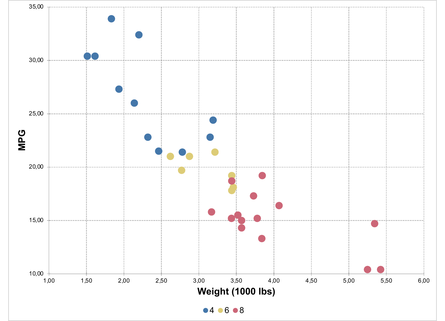
12.9.1.5 Pie (with percentage labels)
pie_data <- filter(browser_data, serie == "serie1")

ms_piechart(pie_data, x = "browser", y = "value") |>
chart_data_labels(show_percent = TRUE, position = "outEnd") |>
preview_pptx("static/office/gal_pie.pptx")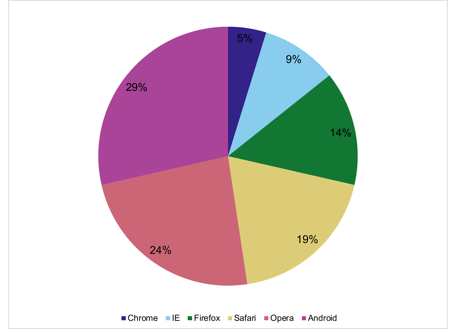
12.9.1.6 Bubble
bub <- mutate(mtcars, cyl = factor(cyl))

ms_bubblechart(bub, x = "wt", y = "mpg", size = "hp", group = "cyl") |>
  chart_labels(xlab = "Weight (1000 lbs)", ylab = "MPG") |>
  preview_pptx("static/office/gal_bubble.pptx")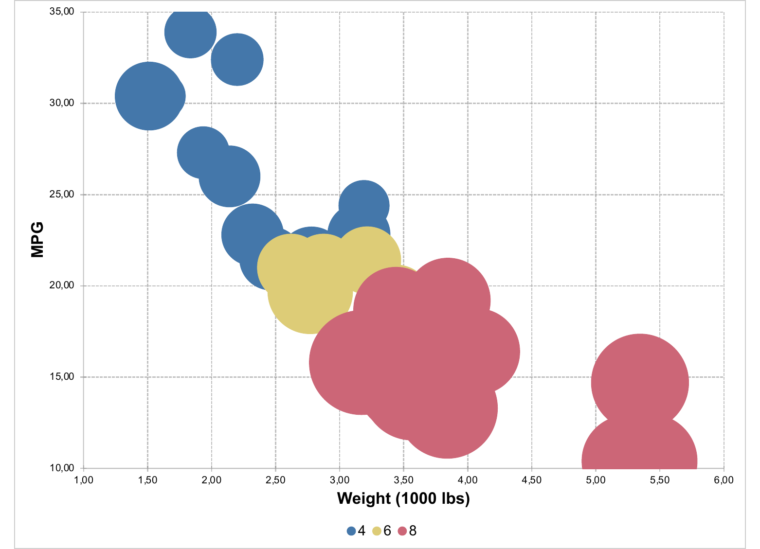
12.9.1.7 Radar
iris reshaped into a long format with one row per (species, dimension)
gives a clean radar input:
iris_long <- iris |>
  group_by(Species) |>
  summarise(across(everything(), mean)) |>
  pivot_longer(-Species, names_to = "dimension", values_to = "value")

ms_radarchart(iris_long,
              x = "dimension", y = "value", group = "Species") |>
  preview_pptx("static/office/gal_radar.pptx")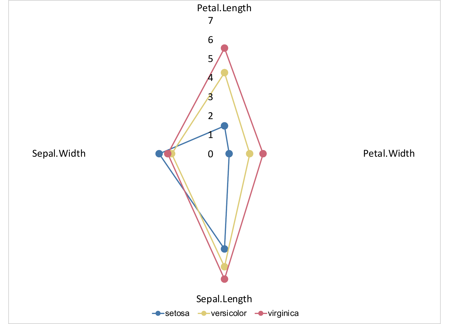
12.9.1.8 Stock (OHLC)
EuStockMarkets is a base R multivariate time series of European
stock indices. Aggregated to monthly open / high / low / close it
feeds straight into ms_stockchart():
dax    <- as.numeric(EuStockMarkets[, "DAX"])
dates  <- seq(as.Date("1991-07-01"), by = "day", length.out = length(dax))
bucket <- format(dates, "%Y-%m-01")

ohlc <- tibble(date = dates, bucket = bucket, value = dax) |>
  group_by(bucket) |>
  summarise(
    month = as.Date(first(bucket)),
    open  = first(value),
    high  = max(value),
    low   = min(value),
    close = last(value),
    .groups = "drop"
  ) |>
  select(month, open, high, low, close)

ms_stockchart(ohlc, x = "month",
              open = "open", high = "high",
              low  = "low",  close = "close") |>
  chart_ax_x(num_fmt = "yyyy-mm") |>
  preview_pptx("static/office/gal_stock.pptx")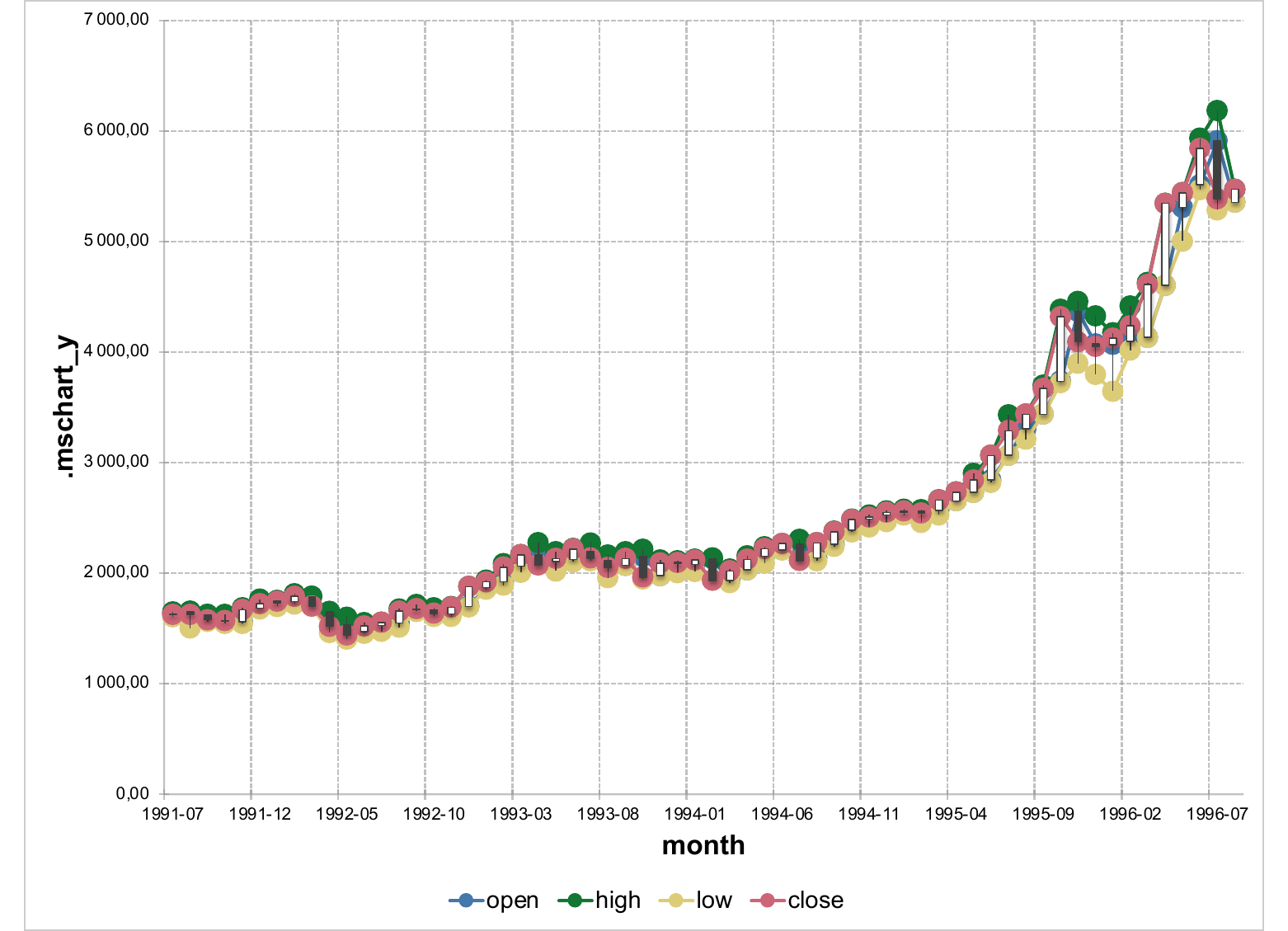
Drop the open argument to get an HLC chart instead of OHLC.
The seven layouts below come from Office’s chartEx family (Office 2016+). They render natively in modern Office; older viewers fall back to a placeholder.
12.9.1.9 Box-and-whisker
set.seed(1)
box_data <- data.frame(
  group = rep(c("g1", "g2", "g3"), each = 20),
  value = c(rnorm(20, 10, 2), rnorm(20, 12, 3), rnorm(20, 8, 1.5))
)

ms_boxplotchart(box_data, x = "group", y = "value") |>
  preview_pptx("static/office/gal_boxplot.pptx")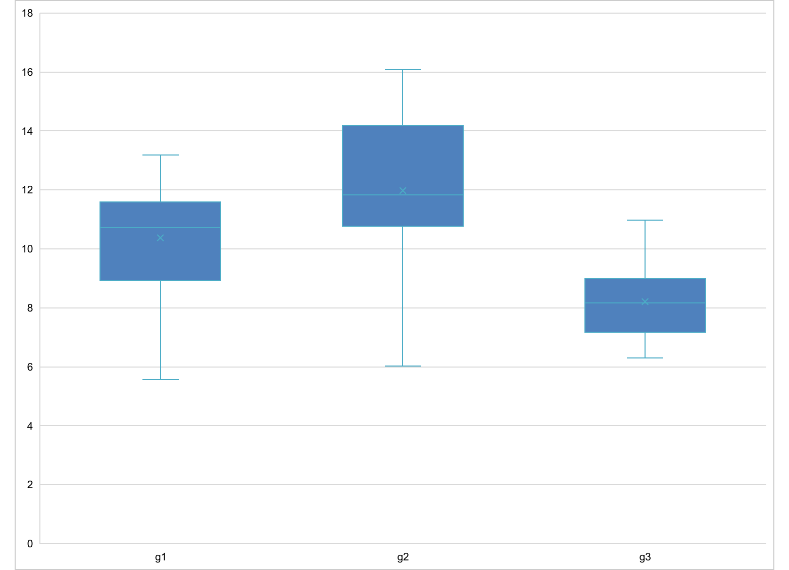
12.9.1.10 Funnel
funnel_data <- data.frame(
  stage = c("Visitors", "Leads", "Opportunities", "Quotes", "Customers"),
  count = c(5000, 4000, 3000, 1000, 250)
)

ms_funnelchart(funnel_data, x = "stage", y = "count") |>
  preview_pptx("static/office/gal_funnel.pptx")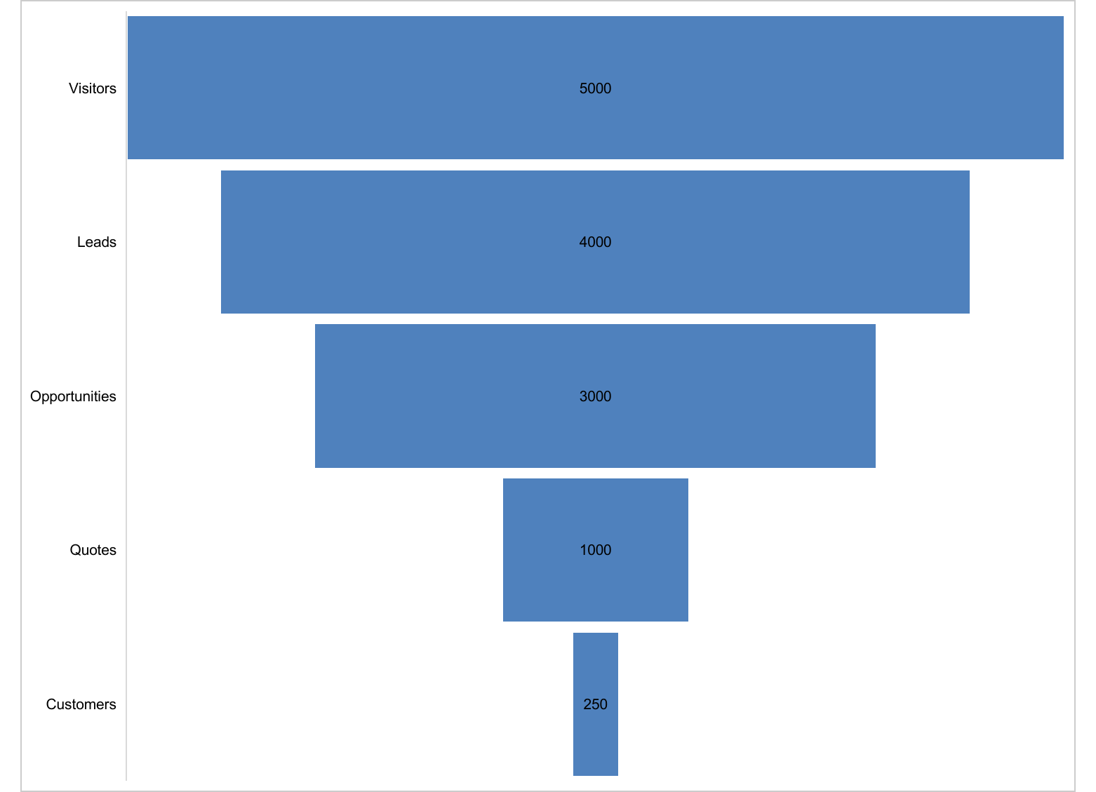
12.9.1.11 Histogram
ms_histogramchart() takes raw observations and lets Office compute
the bins. bin_count (or bin_width) controls binning:
hist_data <- data.frame(x = rnorm(120, mean = 50, sd = 10))

ms_histogramchart(hist_data, value = "x", bin_count = 10) |>
  preview_pptx("static/office/gal_histogram.pptx")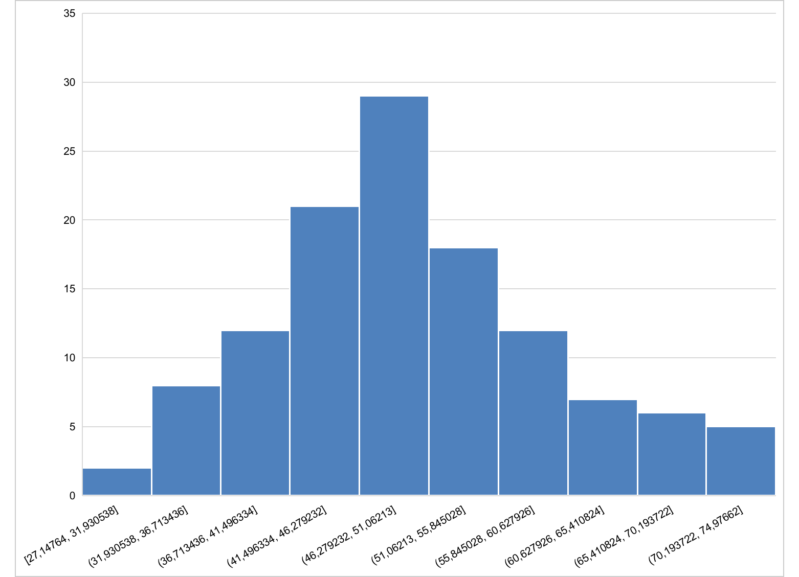
12.9.1.12 Pareto
Categories are sorted by descending count and a cumulative percentage
line is drawn on a secondary axis. Pass aggregate = FALSE when the
data is already aggregated:
pareto_data <- data.frame(
  defect = c("A", "B", "C", "D", "E"),
  n      = c(40, 25, 15, 12, 8)
)

ms_paretochart(pareto_data, x = "defect", y = "n", aggregate = FALSE) |>
  preview_pptx("static/office/gal_pareto.pptx")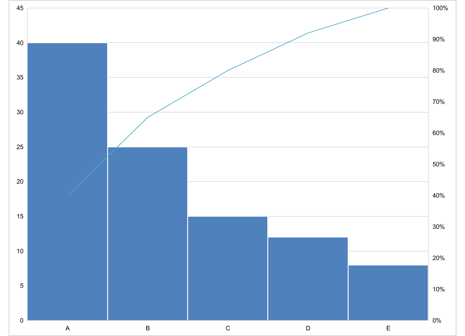
12.9.1.13 Sunburst
Hierarchical data: pass the columns describing the hierarchy in
path (root first), and the leaf value in value:
hier_data <- data.frame(
  region = c("A", "A", "B", "B", "C", "C"),
  city   = c("a1", "a2", "b1", "b2", "c1", "c2"),
  value  = c(40, 25, 30, 18, 22, 12)
)

ms_sunburstchart(hier_data, path = c("region", "city"), value = "value") |>
  preview_pptx("static/office/gal_sunburst.pptx")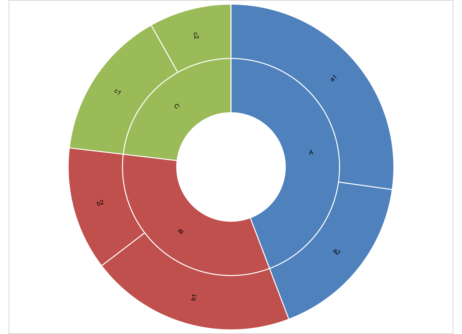
12.9.1.14 Treemap
Same input shape as sunburst:
ms_treemapchart(hier_data, path = c("region", "city"), value = "value") |>
  preview_pptx("static/office/gal_treemap.pptx")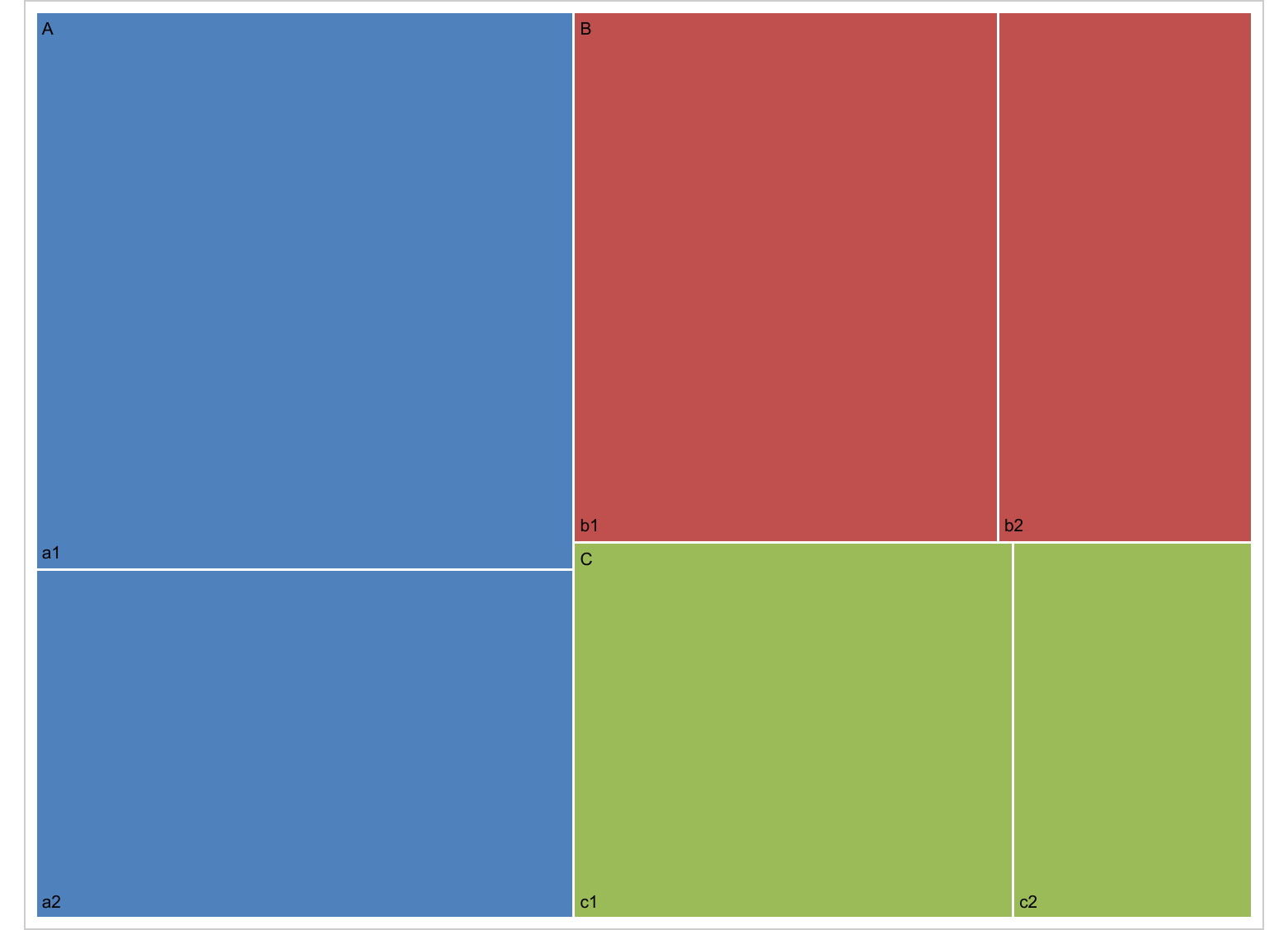
12.9.1.15 Waterfall
Each row is a positive or negative delta. subtotals marks the rows
that Excel should draw as full totals (typically the opening and
closing balances):
wf_data <- data.frame(
  step   = c("Start", "Q1", "Q2", "Q3", "End"),
  amount = c(100, 30, -20, 40, 150)
)

ms_waterfallchart(wf_data, x = "step", y = "amount", subtotals = c(1, 5)) |>
  preview_pptx("static/office/gal_waterfall.pptx")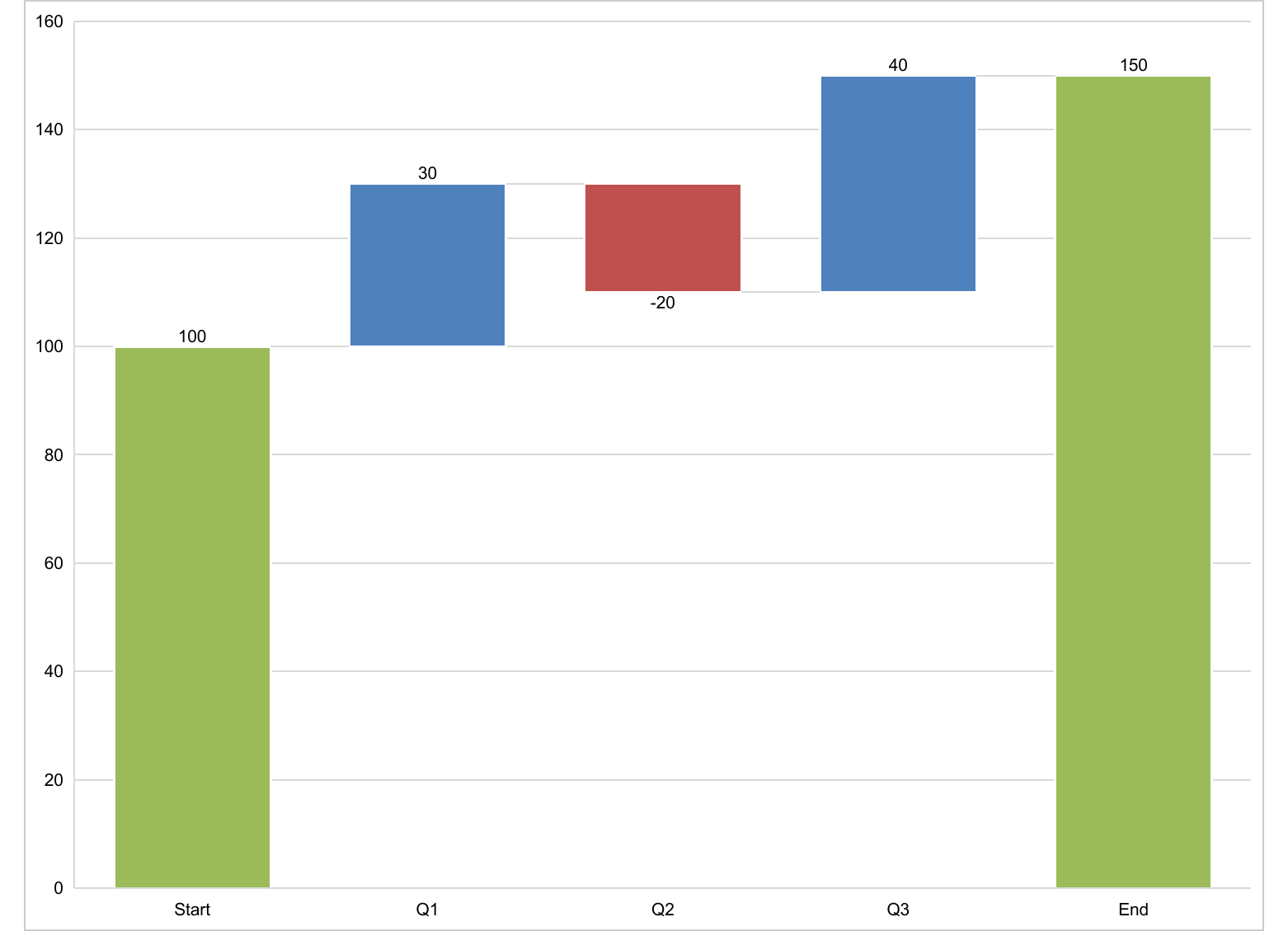
12.9.2 Recipes
12.9.2.1 Highlight one series with a different colour
Pass a named vector to chart_data_fill() so most series share a
muted colour and the one to emphasise stands out:
ms_barchart(browser_data, x = "browser", y = "value", group = "serie") |>
  chart_data_fill(values = c(serie1 = "#9ECAE1",
                             serie2 = "#9ECAE1",
                             serie3 = "#D62728")) |>
  chart_data_stroke(values = "transparent") |>
  preview_pptx("static/office/rec_highlight.pptx")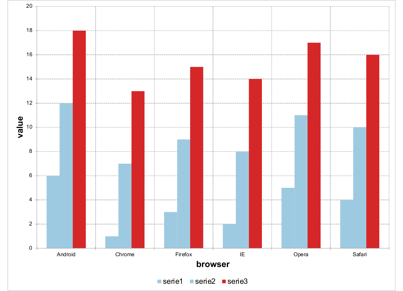
The same idea applies to a single-series chart: convert the category column to a factor whose level order matches the data, then pass a named vector of fills indexed by category name.
12.9.2.2 Sort bars by total value
ms_barchart() follows the order of the levels of the x column.
Compute the desired order once, apply it as a factor on the data, and
the chart picks it up:
ord <- browser_data |>
  group_by(browser) |>
  summarise(total = sum(value)) |>
  arrange(desc(total)) |>
  pull(browser)

sorted <- browser_data |>
  mutate(browser = factor(browser, levels = ord))

ms_barchart(sorted, x = "browser", y = "value", group = "serie") |>
  as_bar_stack() |>
  preview_pptx("static/office/rec_sort.pptx")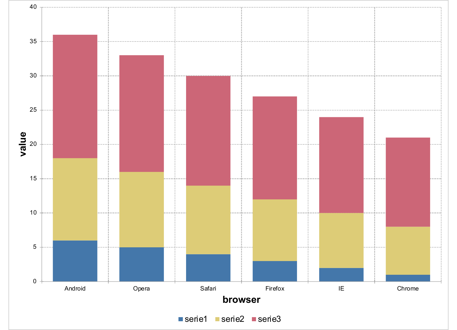
12.9.2.3 Target / reference line on a bar chart
Combine the bar chart with a one-series line chart that holds the target value repeated across each category:
target <- browser_data |>
  distinct(browser) |>
  mutate(value = 220)

bars <- ms_barchart(browser_data, x = "browser",
                    y = "value", group = "serie") |>
  as_bar_stack()

line <- ms_linechart(target, x = "browser", y = "value") |>
  chart_data_stroke(values = "#D62728") |>
  chart_data_line_width(values = 2) |>
  chart_data_symbol(values = "none")

ms_chart_combine(bars = bars, target = line) |>
  preview_pptx("static/office/rec_target.pptx")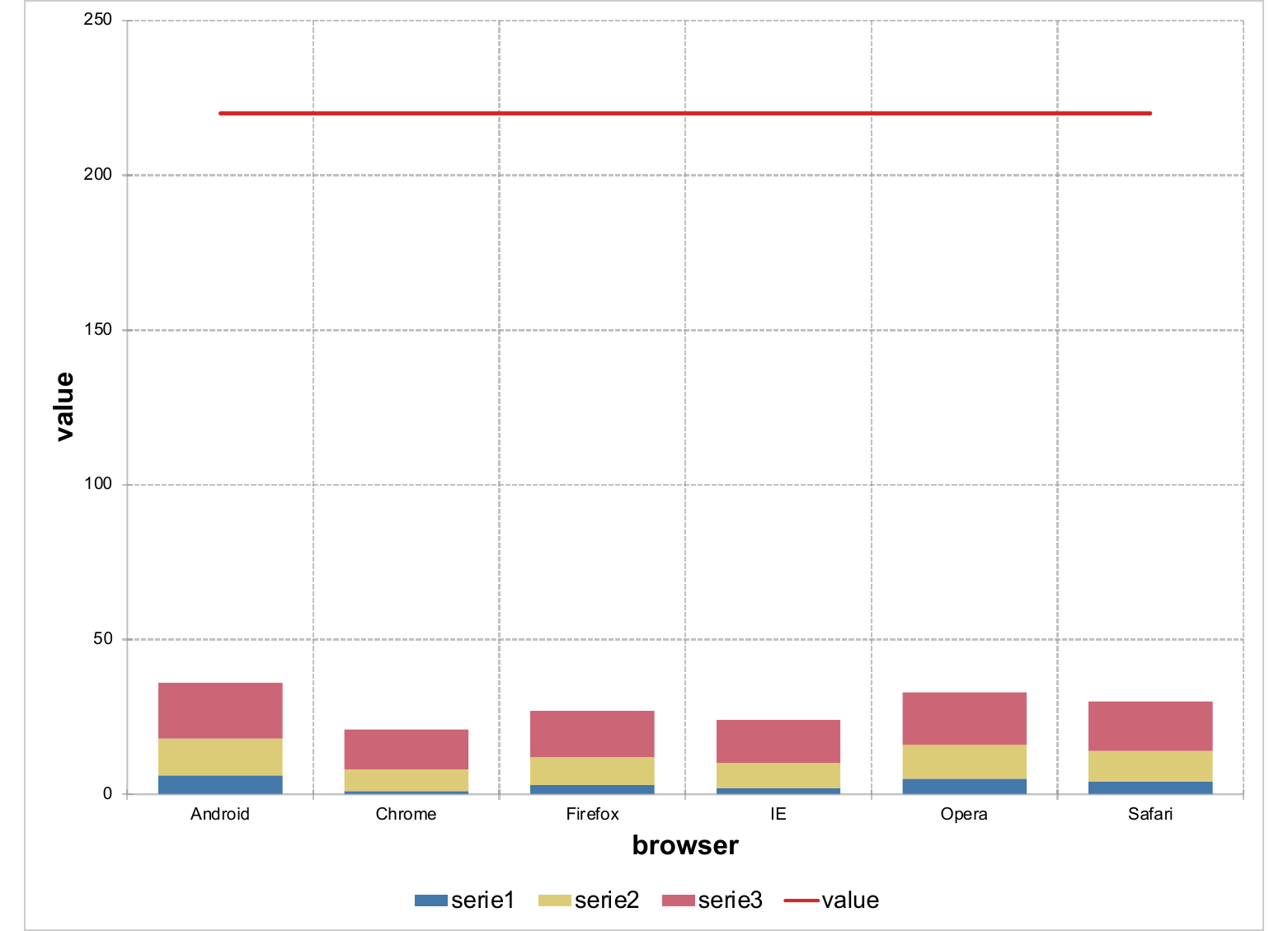
12.9.2.4 Error bars on a bar chart
Combine a bar chart with a stock chart whose high / low are
mean ± SE and whose close is the mean. The hi_low_lines of the
stock chart becomes the vertical whisker; dash markers on high
and low become the T-shaped caps; the mean series is hidden so
only the bars and the whiskers show:
df <- mtcars |>
  group_by(cyl) |>
  summarise(mean = mean(mpg),
            se   = sd(mpg) / sqrt(n())) |>
  mutate(cyl  = factor(cyl),
         high = mean + se,
         low  = mean - se,
         avg  = mean)

bars <- ms_barchart(df, x = "cyl", y = "avg")

errs <- ms_stockchart(df, x = "cyl",
                      high = "high", low = "low", close = "mean") |>
  chart_settings(hi_low_lines = fp_border(color = "black", width = 1.5)) |>
  chart_data_line_style(values = c(high = "none",
                                   low  = "none",
                                   mean = "none")) |>
  chart_data_line_width(values = c(high = 0, low = 0, mean = 0)) |>
  chart_data_symbol(values = c(high = "dash",
                               low  = "dash",
                               mean = "none")) |>
  chart_data_size(values = c(high = 8, low = 8, mean = 0))

ms_chart_combine(bars = bars, errs = errs) |>
  preview_pptx("static/office/rec_errbar.pptx")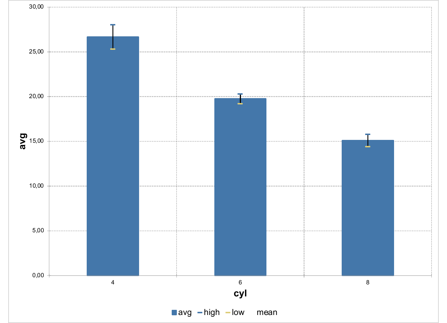
The same recipe applies to standard deviations, confidence intervals
or interquartile ranges — only the high / low definitions change.
12.9.2.5 Trend line on a scatter plot
mschart does not expose native trendlines (<c:trendline>).
Compute the regression in R and add the fitted values as a second
series of the same scatter chart, then style each series so the data
shows as markers and the trend as a line. style = "lineMarker" at
the chart level is what allows both visuals to coexist:
fit <- fitted(lm(mpg ~ wt, data = mtcars))

dat <- bind_rows(
  tibble(wt = mtcars$wt, mpg = mtcars$mpg, serie = "data"),
  tibble(wt = mtcars$wt, mpg = fit,        serie = "trend")
)

ms_scatterchart(dat, x = "wt", y = "mpg", group = "serie") |>
  chart_settings(style = "lineMarker") |>
  chart_data_symbol(values = c(data = "circle", trend = "none")) |>
  chart_data_line_style(values = c(data = "none", trend = "solid")) |>
  chart_data_line_width(values = c(data = 0, trend = 2)) |>
  preview_pptx("static/office/rec_trend.pptx")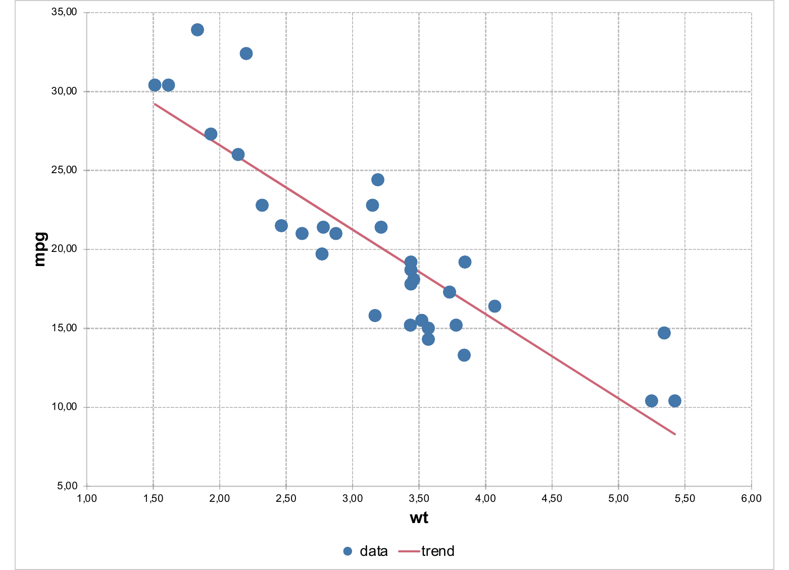
The fit is computed in R, so any model works — lm, loess, lqs,
polynomial, locally weighted, etc. Just feed the fitted values into
the second series.
12.10 Embedding a chart in a document
A chart object on its own does nothing — it has to be attached to a
Word, PowerPoint or Excel file produced by officer. The three
destinations have very different ergonomics, so they are covered
separately below.
12.10.1 Excel — recommended path: write your data, then attach the chart
In Excel, the chart and the data live on the same sheet and are
visible to the user. You can let mschart write the underlying data
itself, but in practice it is almost always better to write the data
yourself first, then attach the chart and tell it to reference the
existing data.
write_data is unrelated to the constructor’s asis argument: asis
chooses the shape mschart reads at construction time (see Input
shape: long vs wide (asis)), write_data decides whether mschart
writes the chart’s data into the sheet at embed time. Any combination
of the two is valid.
Why: when mschart writes the data automatically, it goes through a
generic reshape (chart$data_series) designed to fit any chart type.
The result is a long-format table that lands in the cells next to the
chart. That layout is correct, but it is rarely what an Excel user
wants to see: it ignores your column order, your headers, your
sheet-level conventions, the fact that several charts may share the
same dataset, or that you want the data on a different sheet entirely.
You know your problem better than the mschart reshape does.
The recommended pattern is therefore:
- Build the chart object with
mschartas usual. - Write the data to the sheet at the position and in the shape you
want, with
officer::sheet_write_data()(or anything else that ends up putting values in cells). - Attach the chart with
officer::sheet_add_drawing(), passwrite_data = FALSE, and pointstart_col/start_rowat the top-left cell of the data block.
library(mschart)
library(officer)

bars <- ms_barchart(browser_data,
                    x = "browser", y = "value", group = "serie")

wb <- read_xlsx()
wb <- add_sheet(wb, label = "sales")

# 1. Write the data exactly where you want it.
wb <- sheet_write_data(wb, sheet = "sales",
                       value = bars$data_series,
                       start_col = 1, start_row = 1)

# 2. Attach the chart and tell it to reuse the data already in place.
wb <- sheet_add_drawing(wb, sheet = "sales", value = bars,
                        write_data = FALSE,
                        start_col = 1, start_row = 1,
                        left = 5, top = 0.5,
                        width = 6, height = 4)

print(wb, target = "example.xlsx")
bars$data_series is the data frame that mschart would have written
itself. You can transform it (rename columns, reorder rows, drop
helper columns) before calling sheet_write_data() if it makes more
sense for the workbook.
The same pattern lets you share one dataset between several charts on
the same sheet: write the data once, then call sheet_add_drawing()
for each chart with write_data = FALSE. See the Embedding charts
section of the Excel chapter for the full reference.
The lazy path — letting mschart write the data itself — still works
and is fine for throw-away examples:
12.10.2 PowerPoint
Charts are added like any other content, with ph_with() and a
placeholder location:
doc <- read_pptx()
doc <- add_slide(doc, layout = "Title and Content", master = "Office Theme")
doc <- ph_with(doc, value = bars, location = ph_location_fullsize())
print(doc, target = "example.pptx")
See the PowerPoint chapter for placement, layouts and placeholders.